What’s Blocking Conversions
The issues most likely to cost you customers, most important first.
How a second look works
On your own report, most findings have a “Not right for your page?” button. Tell us it’s already on your page, or that you did it on purpose, and the finding is set aside (it stays in your score). For findings about your first screen and your offer, you can also ask for a second look: our AI looks at your page again with what you told us. If it agrees, your report shows a second score with your context beside the checklist score. If it doesn’t, it says why it would still change it. On this sample, the store owner asked about two findings; look for “Our second look”.
We didn't find your Meta Pixel
How to fix it on Shopify
- Install Meta's Facebook & Instagram app from the Shopify App Store, connect your Meta business account and choose your pixel.
- Shopify then sends page views and purchases without any code.
Headline doesn't match your ad
Our second look New
That makes sense for your page.
Your headline currently talks about new arrivals rather than the 20% off deal from the ad, so people clicking that ad may feel confused at first. Since this page serves many kinds of visitors, not just ad clicks, keeping a general headline is a reasonable choice, so no change is needed here.
The person who ran this audit told us more about the page, and we looked again.
Set aside by the person who ran this audit
They said they did this on purpose.
This page is our summer collection for every visitor, not only people from ads, so the headline leads with new arrivals. The 20% off code is in the navy band below the products.
Suggested headline
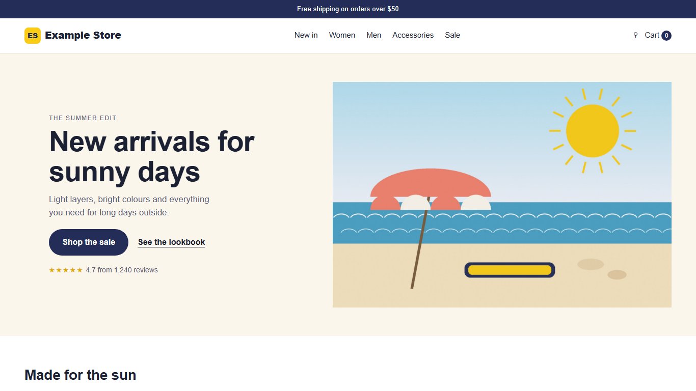
Now: New arrivals for sunny days
“New summer arrivals, 20% off your first order”
This repeats the ad's discount so visitors immediately see the deal they clicked for.
Your offer isn't clear on the first screen
Our second look New
We looked again, and we’d still change this.
The first screen a visitor sees only shows 'New arrivals for sunny days' with no mention of any discount or offer. To fix this, the 20% off deal should be shown right at the top, before someone has to scroll down.
What the store owner told us: “The 20% off code is on the page, in the navy band just below the product grid, and it shows again at checkout.”
Put these in the first screen
- Show the 20% off code mentioned in the ad so visitors see the same deal as the ad promised.
- Add a short free returns or shipping note here since the ad highlights it.
- Mention free returns within 30 days near the top since the ad promotes it.
Give visitors one clear next step
Your page is slow for real visitors
How to fix it on Shopify
- Uninstall apps you don't use; some leave code behind in theme.liquid, so check Online Store → Themes → Edit code after removing one.
- Keep sliders, autoplay video and pop-up apps out of the first screen, and prefer theme features over apps.
Form asks for too much
How to fix it on Shopify
- Edit the contact form in the theme editor (Online Store → Themes → Customize), or in the builder of the form app you use: remove extra fields and label every field.
Don't cover your page with a pop-up
How to fix it on Shopify
- Open your pop-up or email app (Shopify Forms, Klaviyo, Privy…) and turn the pop-up off on mobile, or swap it for a small banner or a teaser button visitors can open themselves.
Your page has gotten slower for real visitors
How to fix it on Shopify
- Uninstall apps you don't use; some leave code behind in theme.liquid, so check Online Store → Themes → Edit code after removing one.
- Keep sliders, autoplay video and pop-up apps out of the first screen, and prefer theme features over apps.
Add a meta description
Suggested meta description
“Shop the summer sale and save 20% on your first order. Free shipping over $50 and free returns within 30 days.”
How to fix it on Shopify
- Home page: Online Store → Preferences → Title and meta description.
- Products, collections and pages: open the item and edit "Search engine listing" at the bottom.
Show the real business in photos or video
Your ad vs. your page
Whether the first screen on a phone follows on from the ad people click, so they know they’re in the right place. Judged by AI. The Offer Alignment score compares your page with this ad; the number below is for reference and isn’t scored again.
Your ad

Summer Sale: 20% off your first order. Free returns within 30 days. Shop now.
What the ad promises: 20% off your first order with free returns within 30 days.
The page follows on from the ad
45/100The page keeps the summer sale theme but doesn't show the 20% discount or free returns promise on the first screen.
Carried over to the page
- Summer sale theme
- Shop now style button
In the ad, not on the first screen
- 20% off mention
- Free returns within 30 days mention
- Discount code SUN20
First impression
How your page looks to someone who clicked an ad and doesn’t know your business yet, judged by AI from screenshots of it on a computer and a phone. We asked our AI twice, and each score is the average of its two answers. It’s a judgement, so read it as an opinion. It counts toward your score, like the categories above.
Judged as a page made for your ads.
Looks professional and current
3.5 out of 5The page uses clean illustration style, consistent colors and clear headlines, but the lookbook section looks like placeholder art rather than a finished design.
What it noticed
- The lookbook section shows only colored boxes with plain shirt shapes instead of finished images, which looks unfinished
- Spacing between the product grid and the Summer Sale banner feels cramped on computer
Photos or video of the real business
1 out of 5Every picture on the page is a flat illustration or icon. There are no real photos of the products, store or customers anywhere.
Earns trust before it asks
4 out of 5There is a star rating near the top and real customer quotes further down the page, which helps build some trust.
Proof it found
- Star rating with review count near the top (4.7 from 1,240 reviews)
- Three named customer quotes with star ratings in the What customers say section
- Free returns within 30 days mentioned in the sale banner
A stranger could act on this page alone
3 out of 5The page explains what is on sale and the discount, but does not say anything about the business itself, shipping times, or how to get help.
Still unanswered
- No information about shipping times or delivery areas beyond the top bar
- No explanation of what the Sun Club membership actually involves beyond a birthday treat
- No contact details anywhere on the page for a visitor with a question
One clear next step
2 out of 5The top of the page has one clear main button, but further down a second long sign-up form competes for attention, and a pop-up covering the whole phone screen interrupts browsing.
What gets in the way
- A pop-up that covers the whole phone screen opens by itself while browsing
What the page asks for
- Shop the sale button at the top
- See the lookbook button at the top
- Join the Sun Club form further down the page
- Newsletter form inside the pop-up
The one change that would help most: Remove the pop-up that covers the whole phone screen and keep just one clear action, since it interrupts visitors who clicked the ad to shop.
From the AI page review
A quicker AI look at the first screen on a phone and the page’s text. It doesn’t change your score.
What it thinks you’re offering: Buy summer clothing items, some with a discounted price shown.
Clear in five seconds
75/100Visitors can quickly tell this is a clothing store with a summer sale and a shop button.
Why it's worth it
60/100It's clear this is a summer clothing sale, but the first screen doesn't mention the 20% discount shown in the ad.
Suggested rewrites for this page
Written by AI from your page. Check each one says what you really offer before you use it.
- Headline
- Now: New arrivals for sunny days
- “New summer arrivals, 20% off your first order”
- This repeats the ad's discount so visitors immediately see the deal they clicked for.
- Button text
- Now: Shop the sale
- “Shop 20% off now”
- This tells visitors exactly what deal they get when they tap, matching the ad.
- Page title (search results)
- “Summer Sale: 20% Off New Arrivals | Example Store”
- Meta description (search results)
- “Shop the summer sale and save 20% on your first order. Free shipping over $50 and free returns within 30 days.”
Put these in the first screen
- Show the 20% off code mentioned in the ad so visitors see the same deal as the ad promised.
- Add a short free returns or shipping note here since the ad highlights it.
- Mention free returns within 30 days near the top since the ad promotes it.
Real visitors’ speed, week by week
How fast your page was for real visitors on phones using Chrome. Each point covers the four weeks before it, so a change to your site takes about four weeks to show in full. This comes from Google. Your speed points are based on real visitors’ results, loading time most of all.
Loading
How long until the main content shows
Slower since August 15. Three months ago: 2.2 seconds.
Responding to taps
How quickly the page reacts when someone taps
Steady over three months.
Staying still
How much the page jumps around while it loads
Steady over three months.
Full Checklist
Everything we checked on your page. Each row says what good looks like: a green check means your page does it, a red X means it doesn’t, and a gray question mark is there for your information.
| Result | What We Checked | Device | Your Page | Target | Details |
|---|---|---|---|---|---|
| Loads fast on phones Google's speed score for phones, tested on a slow mobile connection | Phone | 42 out of 100 | 90 is good; 50 or higher is acceptable | ||
| Main content shows quickly In Google's test on a slow phone connection | Phone | 4.6 seconds | Under 2.5 seconds | ||
| Page doesn't jump around How much things move while the page loads | Phone | Very little movement | Little or no movement | ||
| Page responds to taps while loading In Google's test, how long the page was too busy to respond | Phone | About half a second | Under 0.2 seconds | ||
| Taps respond quickly for real visitors Measured from real visitors on phones | Phone | 0.17 seconds | Under 0.2 seconds | ||
| Loads fast on computers Google's overall speed score for computers | Computer | 78 out of 100 | 90 is good; 50 or higher is acceptable | ||
| Nothing delays the first screen Whether any files must load before anything appears | Phone | About 1.5 seconds of delay | No delay | ||
| Images are sized for phones Whether images are bigger than the screen needs | Phone | About 0.2 MB could be saved | Sized to fit, in a modern format | ||
| Files saved for returning visitors Whether browsers keep your files for next time | Phone | About 0.2 MB reloaded on repeat visits | Files kept for up to a year | ||
| Main image loads first Whether your biggest image is set to load first | Phone | Not marked to load first | Set to load first | ||
| Fast for real visitors Google's speed check from real visitors on phones | Phone | Main content: 3.4 seconds · Taps: 0.17 seconds · Very little movement | Google rates all three good | ||
| Speed holding steady for real visitors Real visitors on phones, last three months | Phone | Slower: 2.2 to 3.4 seconds since August 15 | Steady or faster | ||
| Meta Pixel installed Tells Meta which Facebook and Instagram ads bring customers | Phone | Not installed | Installed | ||
| Google tracking installed Google Analytics, Google Ads or Tag Manager | Phone | Installed | Installed | ||
| Google Tag Manager installed Keeps all your tracking codes in one place | Phone | Installed (GTM-DEMO42) | Installed | ||
| Google Ads conversion tracking installed Tells Google Ads which clicks became customers | Phone | Not seen here; it may be set up in Tag Manager | Installed | ||
| Page is secure (https) The padlock in the browser's address bar | Phone | Secure (https) | Secure (https) | ||
| Not on Google's unsafe-site lists Google's lists of pages suspected of malware, phishing or unwanted software | Phone | Not listed · 2 addresses checked | Not listed | ||
| Ad goes straight to your page Redirects between the link you entered and the page | Phone | No redirect | No redirect | ||
| First screen button The button a visitor sees on a phone without scrolling | Phone | "Shop the sale" | A button for the next step | ||
| A few clear choices on the first screen Buttons and links on a phone's first screen | Phone | 4 buttons and links | 1 to 3 | ||
| First screen button has clear words Length of the first screen button's text | Phone | 13 characters | Between 3 and 29 characters | ||
| First screen button is easy to tap Size of the first screen button on a phone | Phone | 52px | 44px or more (48px recommended) | ||
| Button that asks visitors to act: "Shop the sale" The most prominent button that asks visitors to act | Phone | Opens shop.example.com/collections/summer-sale | One clear main action | ||
| Form is easy to find A form visitors can fill in | Phone | Form on the page | On the page, no click needed | ||
| Form is short Fields visitors have to fill in | Phone | 8 fields | 5 or fewer | ||
| Form has a send button A button to send the form | Phone | Yes | Yes | ||
| Page after the click works The page your main button opens, checked on a phone | Phone | Loaded in 2 seconds | Loads without errors | ||
| Nothing covers the page Pop-ups that open by themselves and cover the page | Phone | A pop-up opened by itself a few seconds after the page loaded, after we took the screenshot, and covered 100% of the phone screen | Nothing covering the page | ||
| Privacy policy next to your form A link that shows how you'll use people's details | Phone | Next to the form | Next to the form | ||
| Contact details on the page Phone, email or address a visitor can use | Phone | None found | At least one | ||
| Reviews or testimonials on the page Proof that other customers were happy | Phone | Testimonials, star rating | Reviews or testimonials | ||
| Page has a title The name shown in the browser tab and in Google's results | Phone | Yes | Yes | ||
| Page has a meta description The short summary Google often shows under your page | Phone | Missing | Yes | ||
| Page has a main heading Your headline marked as the page's main heading | Phone | Yes | Yes | ||
| Only one main heading Headings marked as the main one | Phone | One | Exactly one | ||
| Set up for phones A setting that fits the page to a phone screen | Phone | Yes | Yes | ||
| Page fits the phone screen Nothing sticks out past the edge of the screen | Phone | Fits | No sideways scrolling | ||
| Text is big enough on phones How much of the text is smaller than 12px | Phone | 0% of the text | Under 40% | ||
| Images further down load as people scroll Images below the first screen | Phone | 0 of 11 load as people scroll | Most load as people scroll | ||
| Buttons and links are easy to tap Google's check for size and spacing | Phone | Passed | Passed | ||
| Every form field has a label A name that stays visible above or beside each box | Phone | 2 of 8 only have a hint inside the box | Every field labeled | ||
| Right phone keyboard for each field The @ keyboard for email, the number pad for phone numbers | Phone | Yes, and phones can fill them in | The right keyboard for each | ||
| Headline matches your ad How closely your headline matches your ad, scored by AI | Phone | 40 out of 100 | 60 or higher | ||
| Offer is clear on the first screen How clear your offer is on a phone's first screen, scored by AI | Phone | 35 out of 100 | 60 or higher | ||
| Button mentions your offer How well your buttons match your offer, scored by AI | Phone | 70 out of 100 | 60 or higher | ||
| Page follows on from your ad Your ad compared with your first screen, scored by AI. Shown for reference, not scored | Phone | 45 out of 100 | 60 or higher | ||
| Looks professional and current How the page looks on a computer and a phone, judged by AI | Phone and computer | 3.5 out of 5 (5 of 8 points) | 4 or 5 out of 5 | ||
| Photos or video of the real business Pictures of your people, place, work or results, judged by AI | Phone and computer | 1 out of 5 (0 of 4 points) | 4 or 5 out of 5 | ||
| Earns trust before it asks Reviews, ratings, guarantees and credentials near the ask, judged by AI | Phone and computer | 4 out of 5 (6 of 8 points) | 4 or 5 out of 5 | ||
| A stranger could act on this page alone Who you are, what's offered, where, the cost and what happens next, judged by AI | Phone and computer | 3 out of 5 (2 of 4 points) | 4 or 5 out of 5 | ||
| One clear next step How many different things the page asks for, and what pops up or stays pinned over it, judged by AI | Phone and computer | 2 out of 5 (3 of 12 points) | 4 or 5 out of 5 | ||
| Easy for everyone to use Google's accessibility check, including for screen readers | Phone | 88 out of 100 | 90 or higher | ||
| Passes Google's technical check Google's check for common technical problems | Phone | 96 out of 100 | 90 or higher | ||
| Passes Google's search check Google's check that search engines can read the page | Phone | 85 out of 100 | 90 or higher |
Search & AI Visibility
Whether people can find this page on Google and whether AI assistants can read it and recommend you. These scores sit beside your Conversion Readiness score and don’t change it.
SEO
Can Google find, understand and show this page?
9 passed · 4 to fix
AI visibility
Can ChatGPT, Claude, Perplexity and Google's AI read and recommend it?
2 passed · 4 to fix
How an AI assistant would describe you
Written by AI from this page alone. It’s roughly what an assistant could tell someone who asks about you.
This is an online clothing store running a summer sale on items like tees, hats, sunglasses and dresses. It offers free shipping over $50 and highlights positive customer reviews.
- What you offer
- Summer clothing and accessories on sale
- Who it's for
- Not seen in what the AI read
- Where
- online
- Price
- Prices range from about $25 to $62 depending on item
- How to get started
- Tap Shop the sale to browse discounted items
- How to contact you
- Not seen in what the AI read
Questions it couldn’t answer from your page
- Is there a discount code needed at checkout?
- What is the return policy in detail?
- Does the store ship internationally?
- How can I contact customer service?
- What sizes are offered?
Which AI tools can read this page
From your robots.txt file, which tells search engines and AI tools what they may read.
Search & answers
Blocking these keeps you out of AI answers and AI search.
-
ChatGPT search
OAI-SearchBotAllowed -
ChatGPT (when a user asks it to open a page)
ChatGPT-UserAllowed -
Claude search
Claude-SearchBotAllowed -
Claude (when a user asks it to open a page)
Claude-UserAllowed -
Perplexity
PerplexityBotAllowed -
Perplexity (when a user asks it to open a page)
Perplexity-UserAllowed -
Google Search and AI Overviews
GooglebotAllowed -
Bing and Microsoft Copilot
BingbotAllowed -
Apple Siri and Spotlight
ApplebotAllowed
AI training
Blocking these is your choice. It doesn't keep you out of AI answers.
-
OpenAI training
GPTBotAllowed -
Anthropic training
ClaudeBotAllowed -
Google Gemini training
Google-ExtendedAllowed -
Apple training
Applebot-ExtendedAllowed -
Common Crawl
CCBotAllowed -
Meta training
Meta-ExternalAgentAllowed
Fix these first
The search and AI issues with the biggest effect.
-
1
Make your page answer what customers ask
55 out of 100
-
2
Describe your business for AI
None found
-
3
Answer common questions on your page
None found
-
4
State the facts assistants look for
Not seen in what the AI read: who it's for, how to contact you
-
5
Add structured data
None found
Every SEO check
Can Google find and list it
-
15/15
Google can list this page
Yes
-
5/5
Search engine rules file works
No errors
-
5/5
Page names its main address
This page
-
5/5
Site has a sitemap
Found
Content Google reads
-
10/10
Title fits in Google's results
27 characters
-
0/10
Meta description fits in Google's results
Missing
-
5/5
Headings are in order
One main heading, in order
-
3/5
Enough text to rank
232 words
-
5/5
Images are described
All described
-
5/5
Links are clear to search engines
Yes
-
2/2
Page language is set
Set (en)
Richer listings & link previews
-
0/5
Page has structured data
None found
-
3/5
Link previews are complete
Missing the description
Real visitors' experience
-
0/10
Fast for real visitors
Main content: 3.4 seconds · Taps: 0.17 seconds · Very little movement
Every AI visibility check
Access for AI assistants
-
20/20
AI assistants can read your site
All allowed
-
AI training crawlers
All allowed
-
20/20
Text readable without scripts
90% of the text
-
llms.txt file
Not found
What AI can understand
-
0/15
Business details for AI
None found
-
0/10
Answers common questions
None found
-
14/25
AI can answer questions from this page
55 out of 100
-
Key facts are on the page
Not seen in what the AI read: who it's for, how to contact you
-
Shows when it was updated
None found
Responsive Check
See how your page looks on a computer, a tablet and a phone. A page that looks great on a computer can still lose customers on a phone if it doesn’t fit the screen.
How the page loads on a phone
This is what a visitor sees while your page loads. Every blank frame is time they spend waiting with nothing to look at.
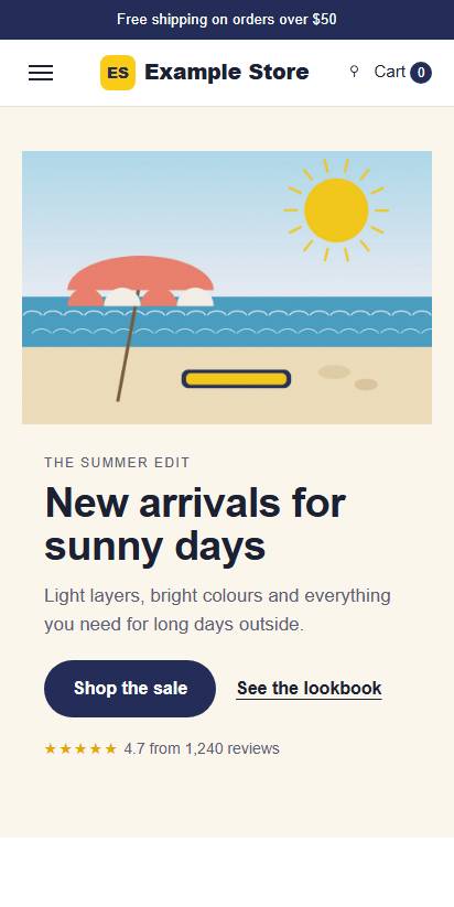
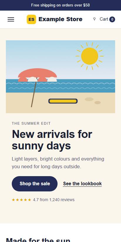
Something on screen in 0.9 seconds. The main content is there at 2.7 seconds and the page stops changing at 3.2 seconds.
-
0.5 s

-
0.9 s First content
-
1.4 s

-
1.8 s
-
2.3 s
-
2.7 s Main content
-
3.2 s Complete
-
3.6 s
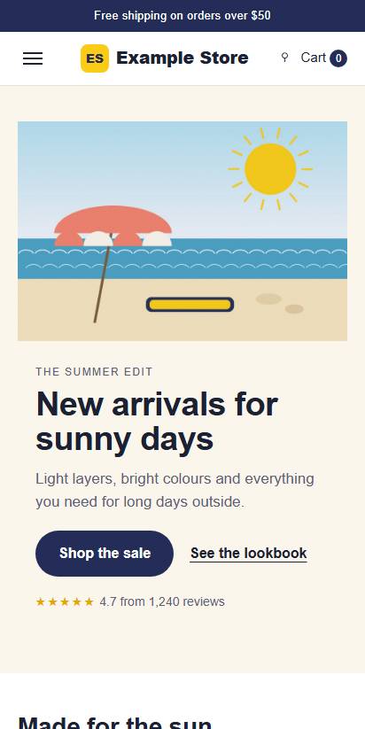
These frames are from Google’s test on a fast connection. The speed checks in this report imitate a slower phone and connection, so their times are longer than these.
Why this matters for conversions
For most businesses, most ad clicks come from phones, especially on Facebook and Instagram, and phones are where pages most often look broken. Your ad account can show you your own numbers.